Brent Cross Town
The Flourishing Index
Report design for research into neighbourhood wellbeing.
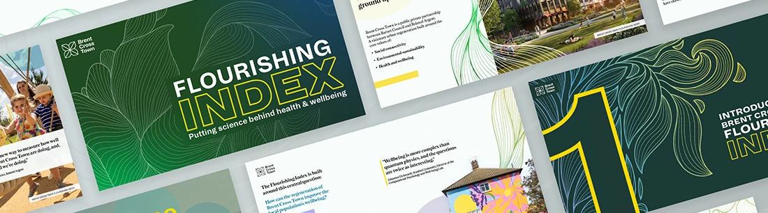


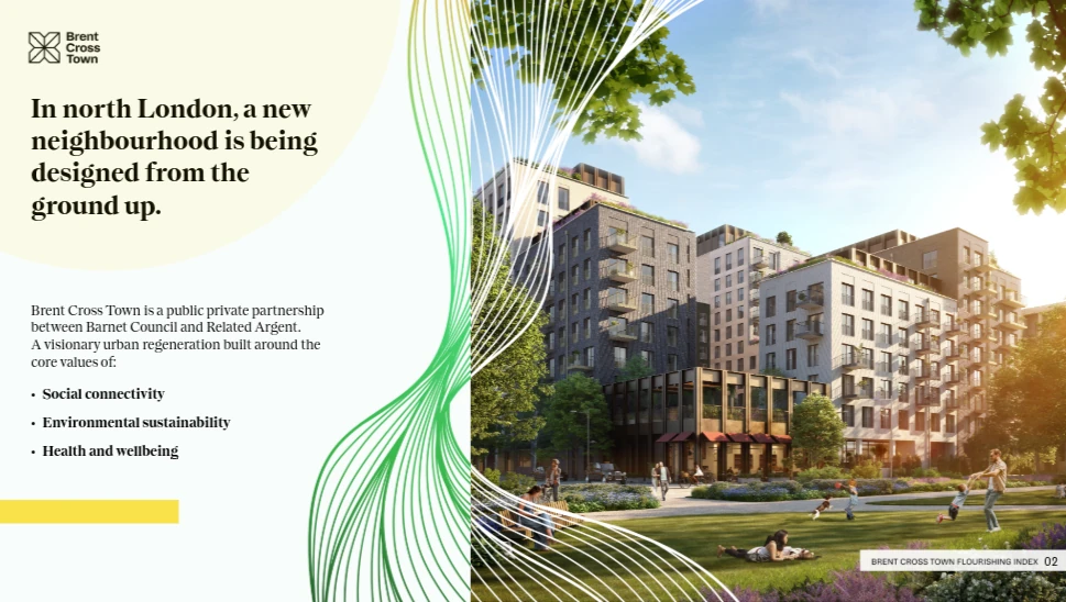
The Flourishing Index looks at how people feel and function in daily life at Brent Cross Town, a regeneration partnership between Related Argent and Barnet Council. It gives the project a way to consider residents’ wellbeing alongside its economic measures.
Alessandro Boaretto led the graphics within Buro Happold’s Visual Communication team. He worked with the research and content teams to turn the 2022 baseline findings into a report for investors and the wider community.
A report for investors and residents
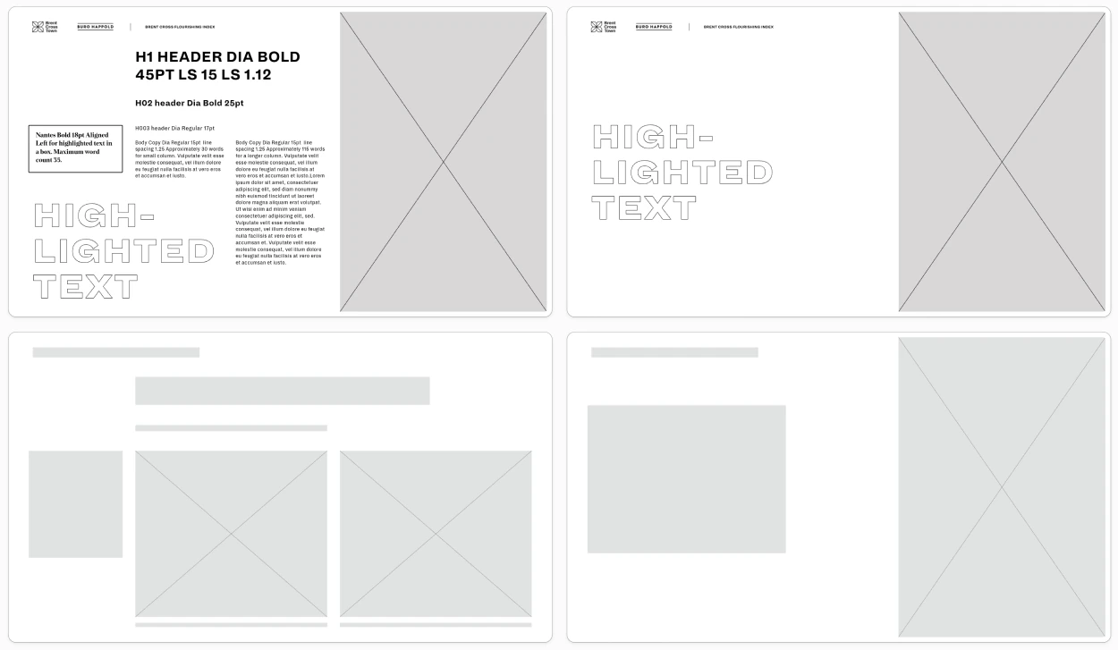
The findings needed to be easy to browse without losing the detail of the research. Investors were the first audience, but the report also had to make sense to the people who lived in the neighbourhood. Each page needed to give readers a clear way into the subject.
The text was still being edited as the design work began. With a public launch planned for early June 2024, the content and design teams had to work alongside one another.
The design priorities
- Meet investors’ needs while remaining open to public readers.
- Reduce dense text and give the visual material room.
- Let each page communicate a clear, self-contained idea.
- Make the main findings easy to scan.
- Create an inviting document people would enjoy exploring.
Editorial planning Working with a changing draft
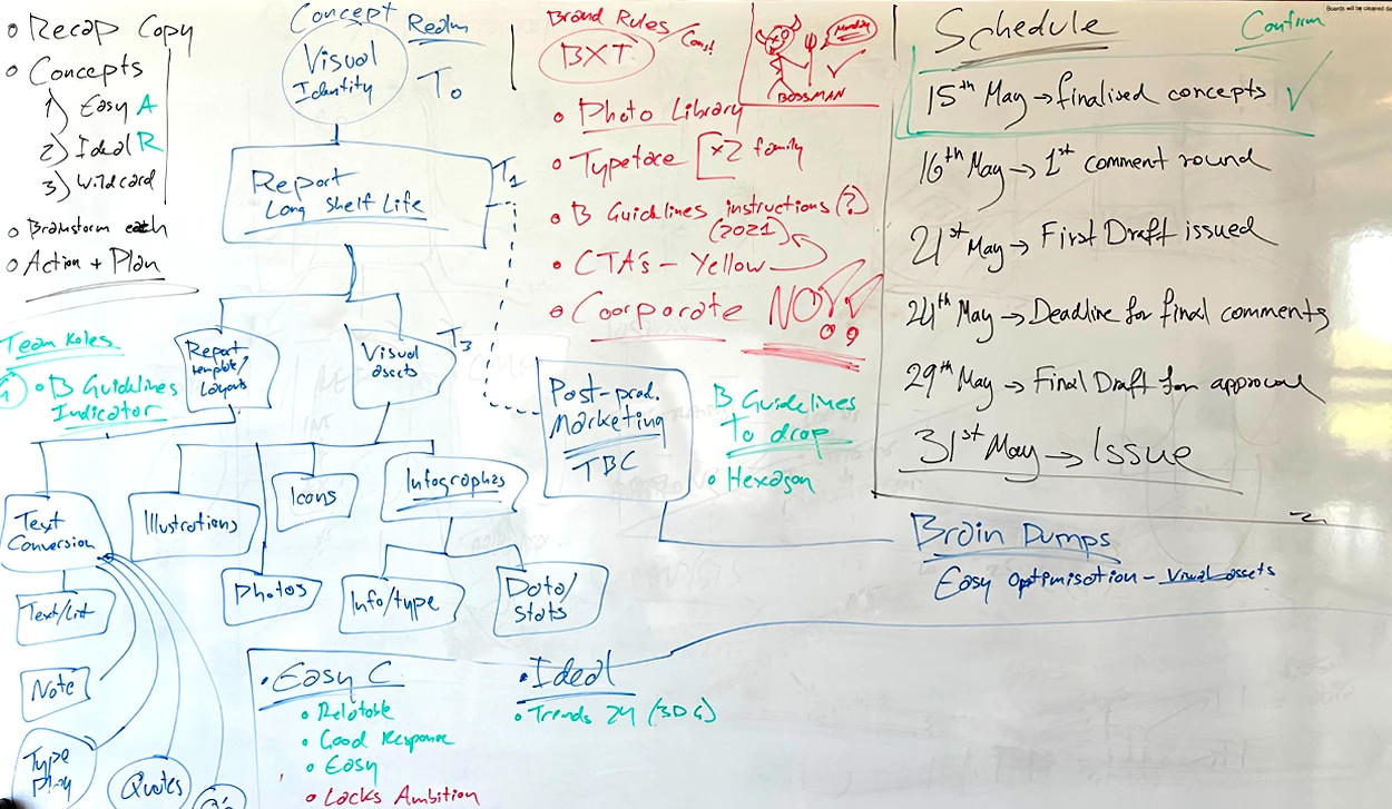
Workshops helped the team understand what the client wanted from the report. They then mapped the tasks, deadlines and responsibilities against the people available to do the work.
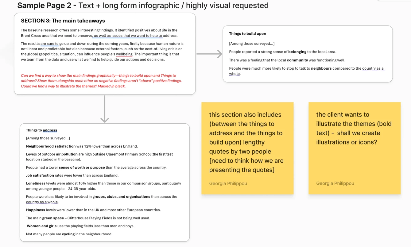
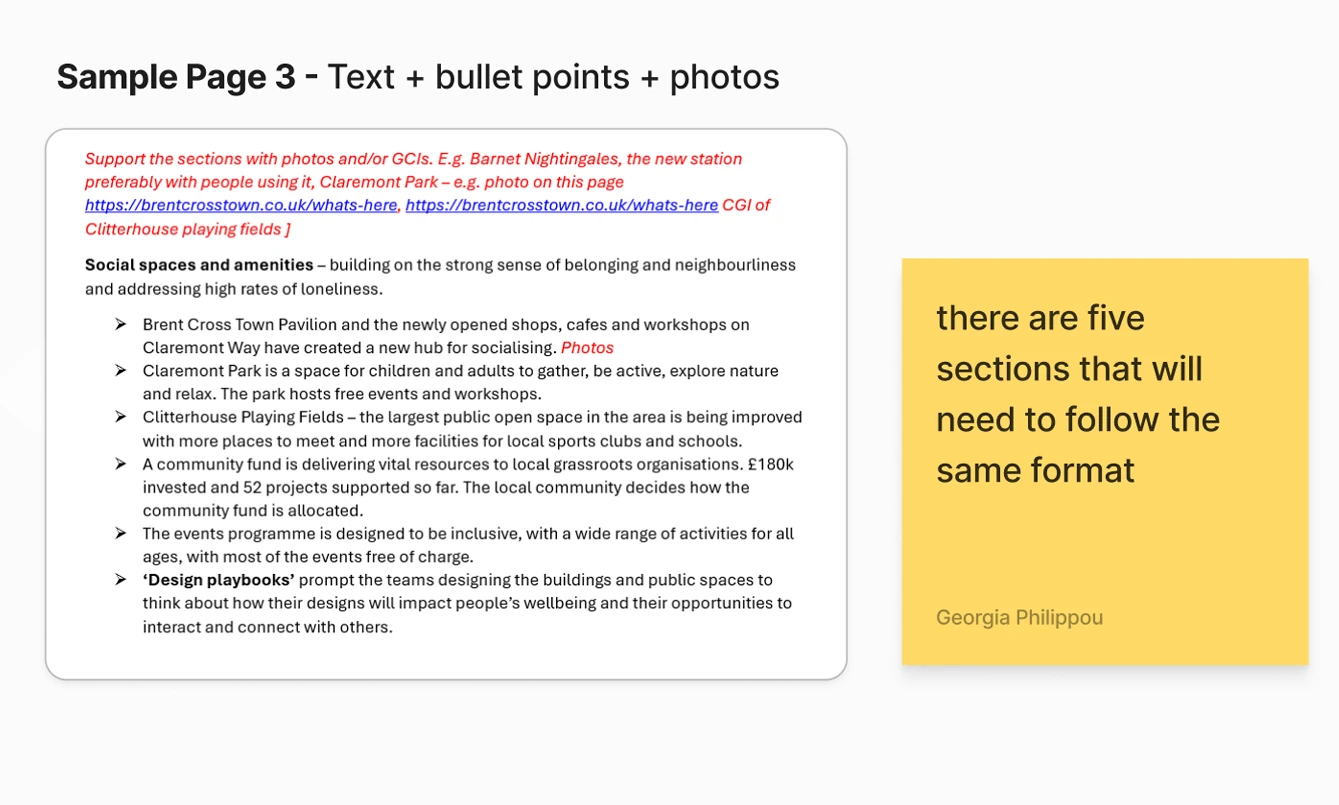
The draft was dense and academic. The team worked through it with the client’s notes, deciding what readers needed first, where the copy could be shorter and where a photograph or graphic would explain a finding more clearly.
Visual design Choosing a direction
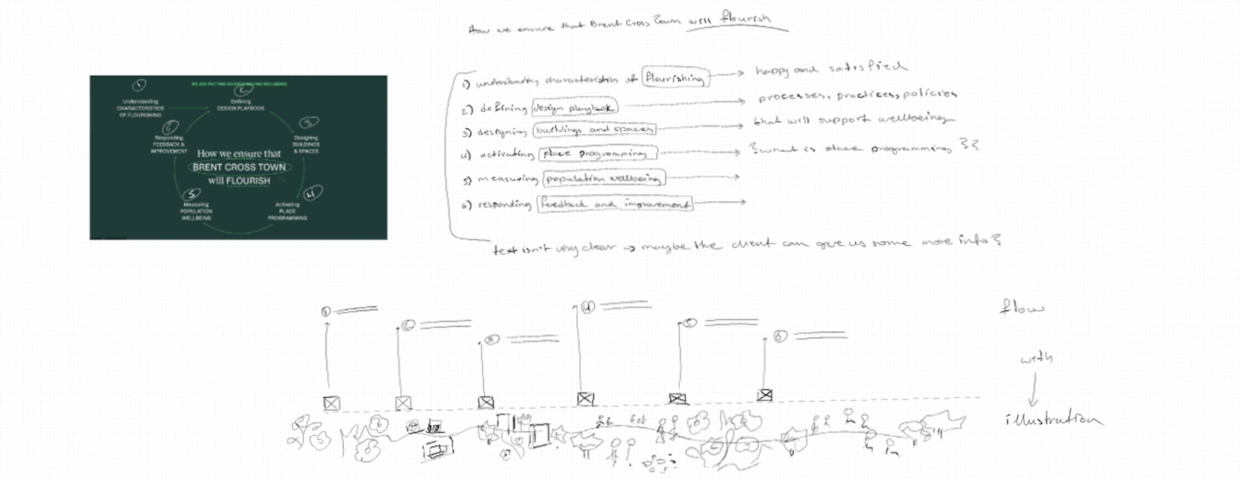
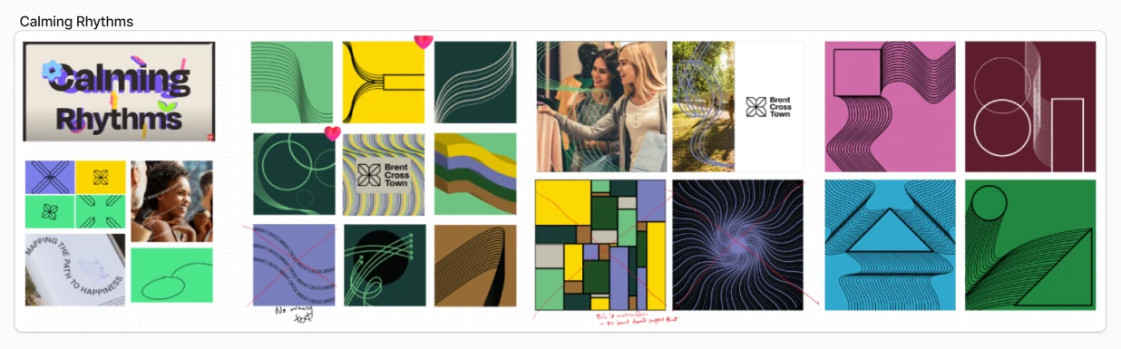
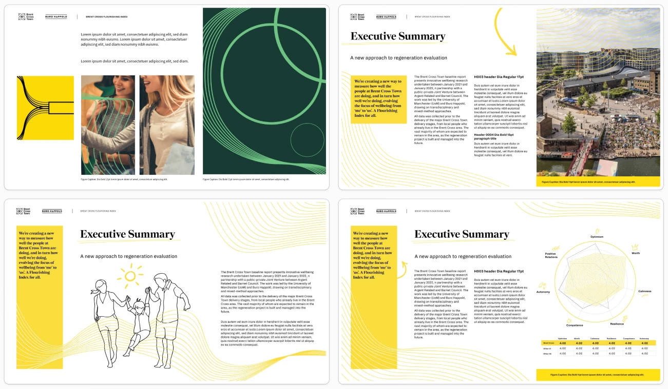
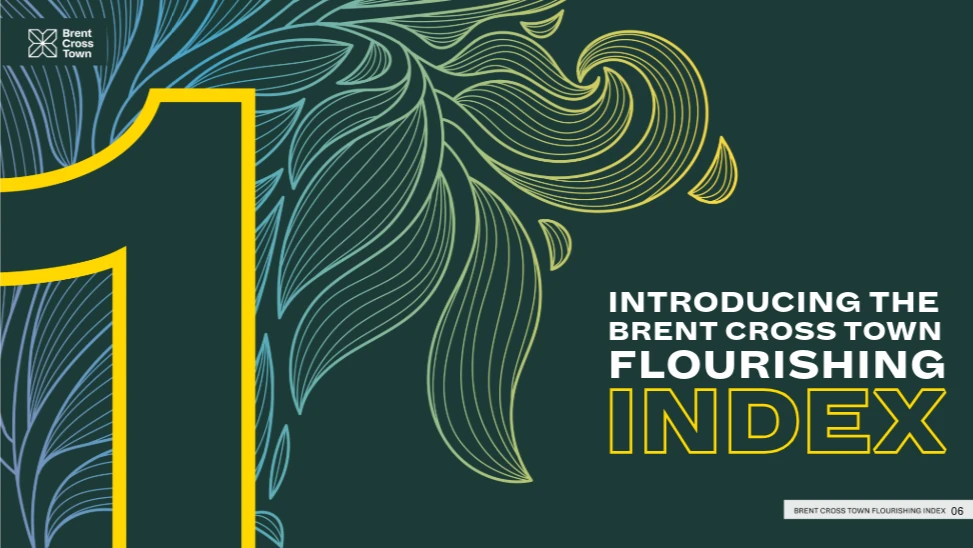
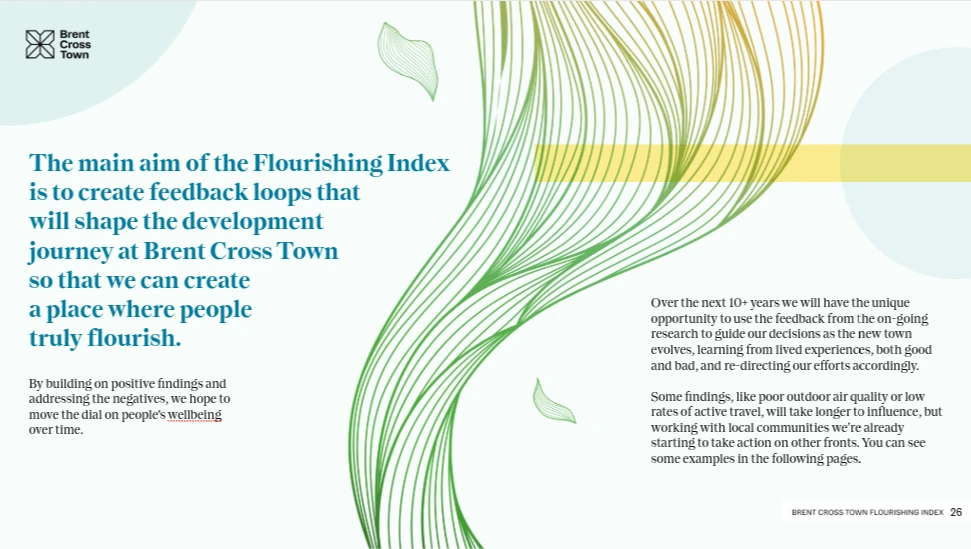
Three directions tested different ways to approach the brief: a restrained geometric design, a softer approach based on natural forms, and a more expressive kaleidoscopic route. The client chose “Calming Rhythms”. Its flowing lines and organic shapes became the basis for the page designs.
Editorial design Building the report together
The team chose Adobe Express so writers and designers could work on the same live document. That flexibility mattered while the copy was changing, though the platform’s layout and asset-management tools set limits on how the report could be built.
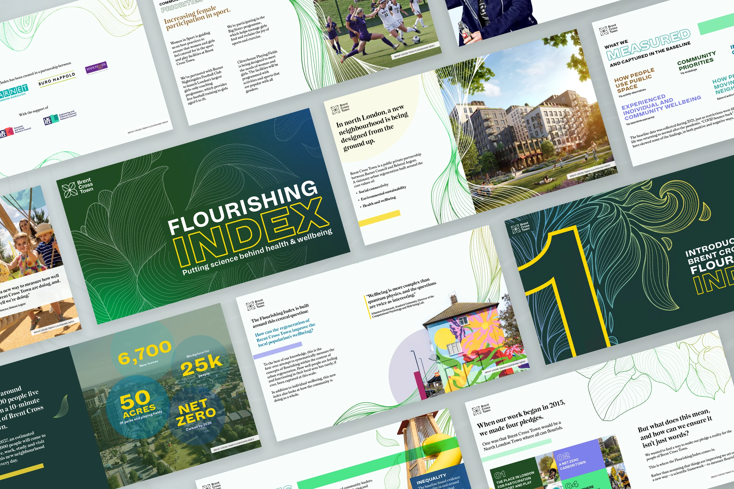
Stock images and custom illustrations gave the pages a shared visual language without making every spread look the same. The team also kept in touch with Adobe’s developers, giving feedback as they worked through the demands of a long, image-heavy publication.
Information design Refining the final pages
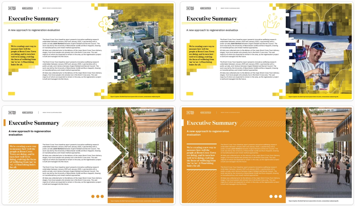
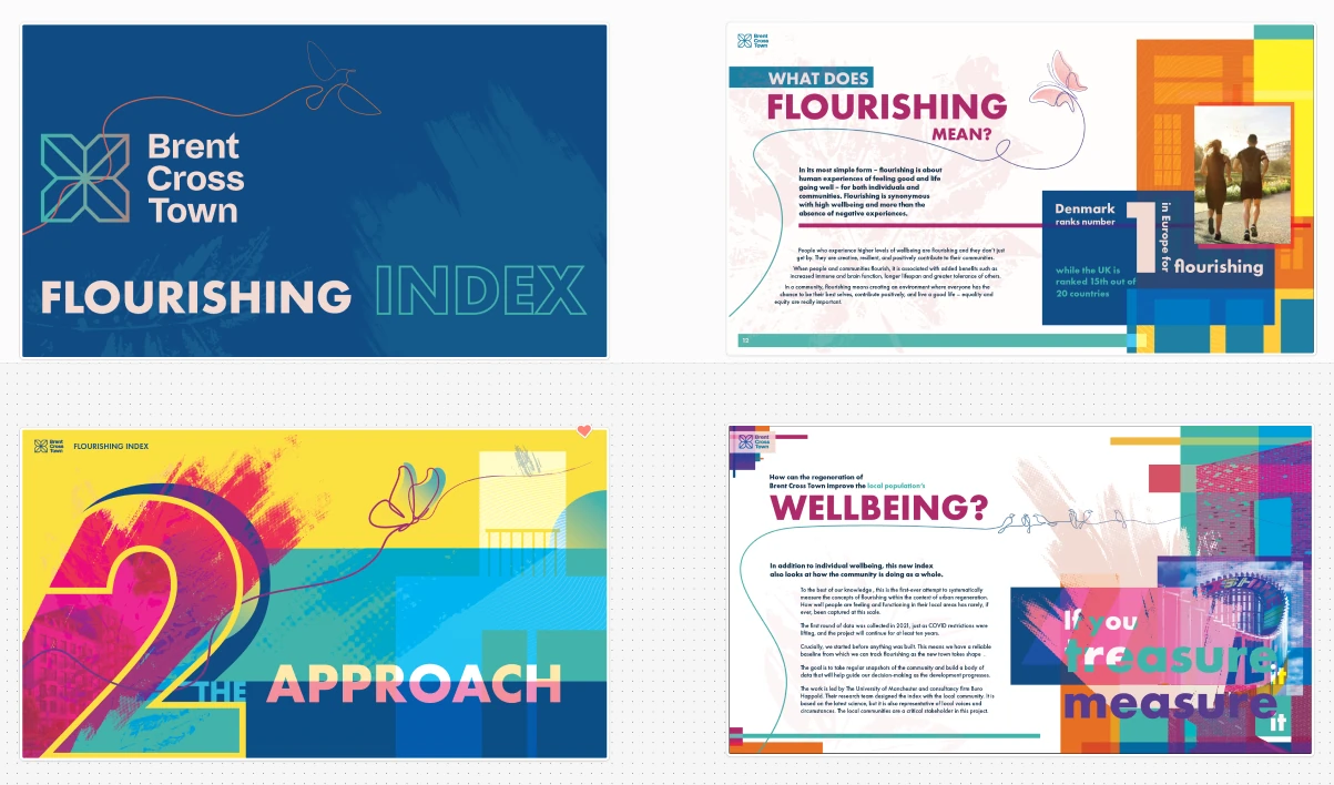
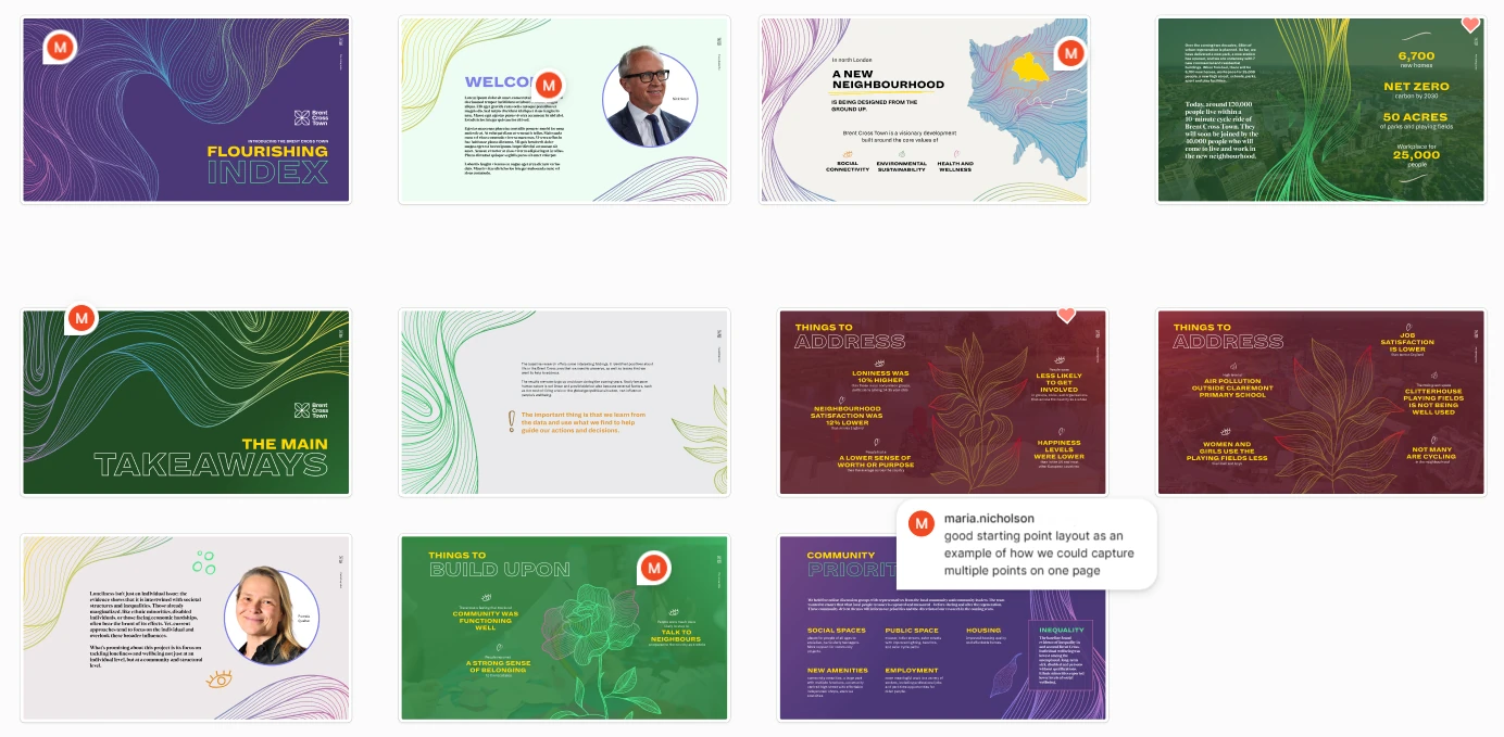
Late in the process, stakeholder feedback brought a change of palette towards greens, blues and neutral tones. The team checked the artwork and revised the affected spreads so the colour held together across the report before launch.
Launch and recognition
The report launched at a public event in June 2024. Client and community feedback praised its clarity and visual presentation. The 2022 findings provide a baseline for tracking wellbeing as the neighbourhood develops.
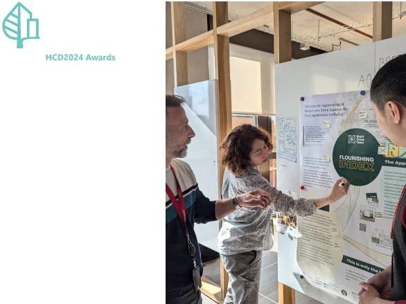
The Flourishing Index was Highly Commended in the Design Research for Healthy Cities category at the 2024 Healthy City Design Awards.